Maria Galland Paris
Relaunch Corporate Website
Pitch, workshop, project: concept lead, UX Design, IA, specification, QA, consulting for C3 Creative Code and Content GmbH (Offices Berlin, Munich, Llublijana)
CMS: Typo3
A rejuvenating cure, please!
Maria Galland Paris has international reputation as brand for decorative cosmetics used in wellness institutes and spas. It’s formula for success is based on the following three expertises: beauty products, treatments and beauty consulting.
Maria Galland was seeking to rejuvenate the brand, which has been on the market for almost 60 years. Moreover one main goal was to modernise the web appearance in order to equally appeal new customers and existing clients and as well inspire these peer groups with the brand’s expertise in unique treatment methods.
Requirements
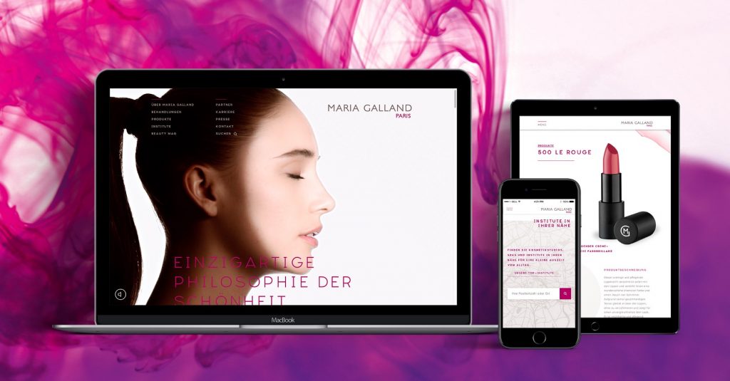
Relaunch the corporate website for 9 markets in 6 languages
______
Set a clear focus on beauty treatment & product scenery
_________
Simplify the Information Architecture
____________
Establish relevant content for a beauty interested audience
________________
Allow personalization depending on market values
______
Reach a younger audience for the brand
_________
Set a clear focus on B2B Service entries and relations
________________
Do all that in Typo3
__________________
Status Quo
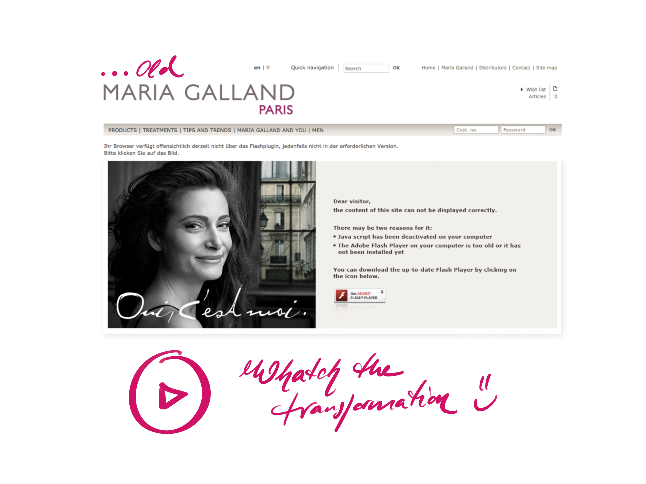
As old fashioned as the website was before the relaunch, it had some big issues to deal with on the architectural manner. Navigation was everywhere, so it was hard to reach and quite confusing. Analytics showed how many users were simply lost and just found their way out real soon.
Despite, the design of the website and also the possibilities given for content staging were so limited, that editors worked with images instead of text to publish something that looked like an article. Also problems of a great amount of duplicated content popped up which made their low ranking search entries obviously reproducible.
And yes, mobile devices got no chance to use the site in an adequate way.
Development

My Role:
Concept lead on pitch, workshop, and project dev, which included pitch presentation, IA ,UX Design, specification, QA & consulting
So what we did was not even giving the brand a fresh and new look on the web. We ordered and rearranged all contents and product descriptions, we simplified the navigation from 5 down to 2 levels + 1 meta level, and build all that up for 9 different markets, which now have some different contents and features given to deal with their individual requirements such as webshop links on product and content levels, etc.
Despite, a new magazine was build up within the site to establish a content marketing approach and give editors a simple way to publish sophisticated articles with great layout, offering dynamically generated contextual relevance and arrangement.
Examples of my work
Wireframes (Sketch)
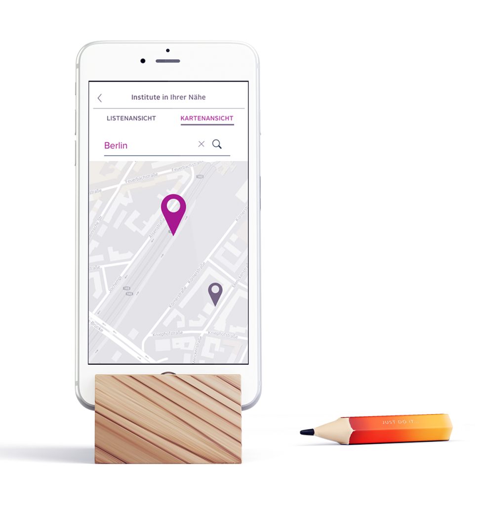
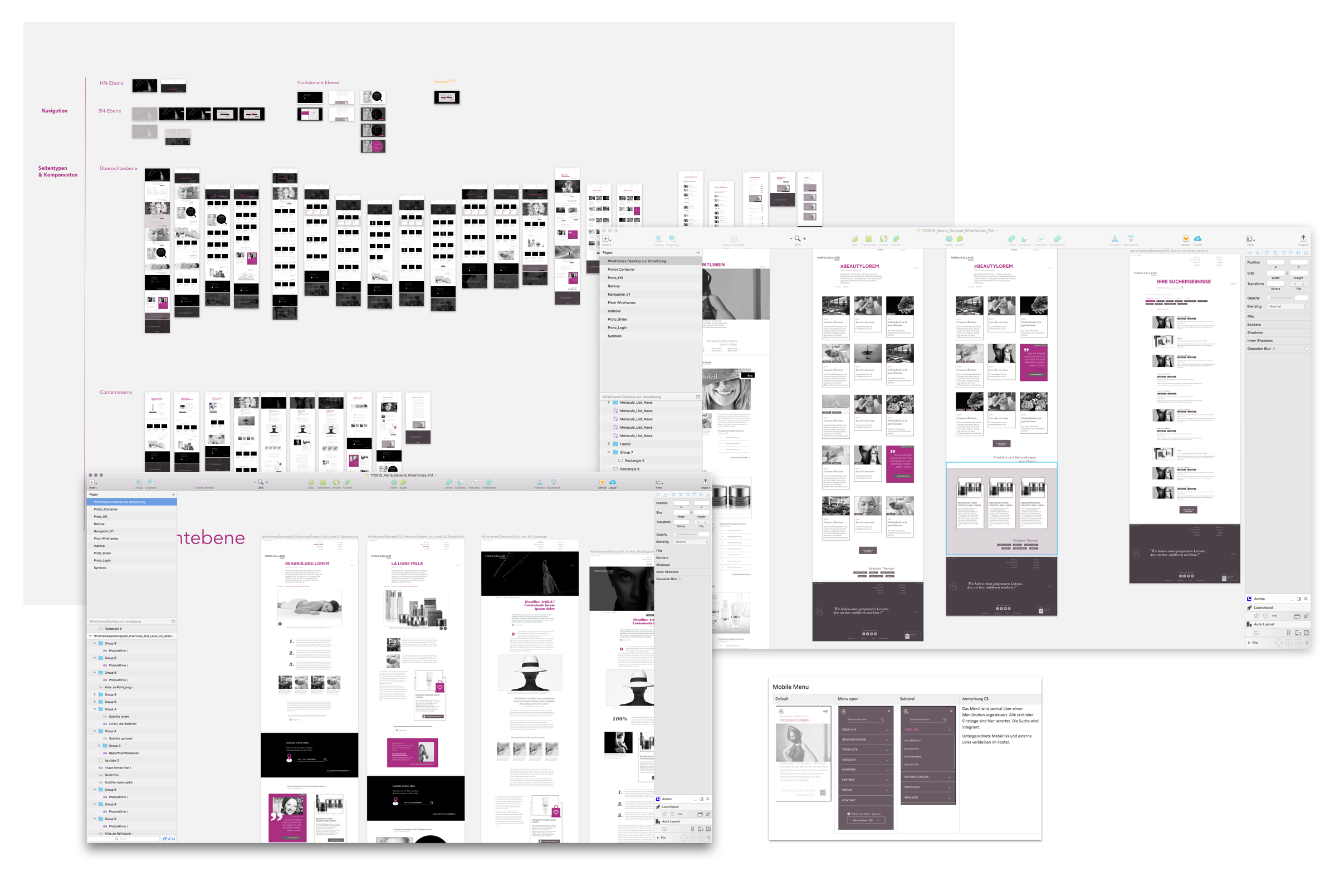
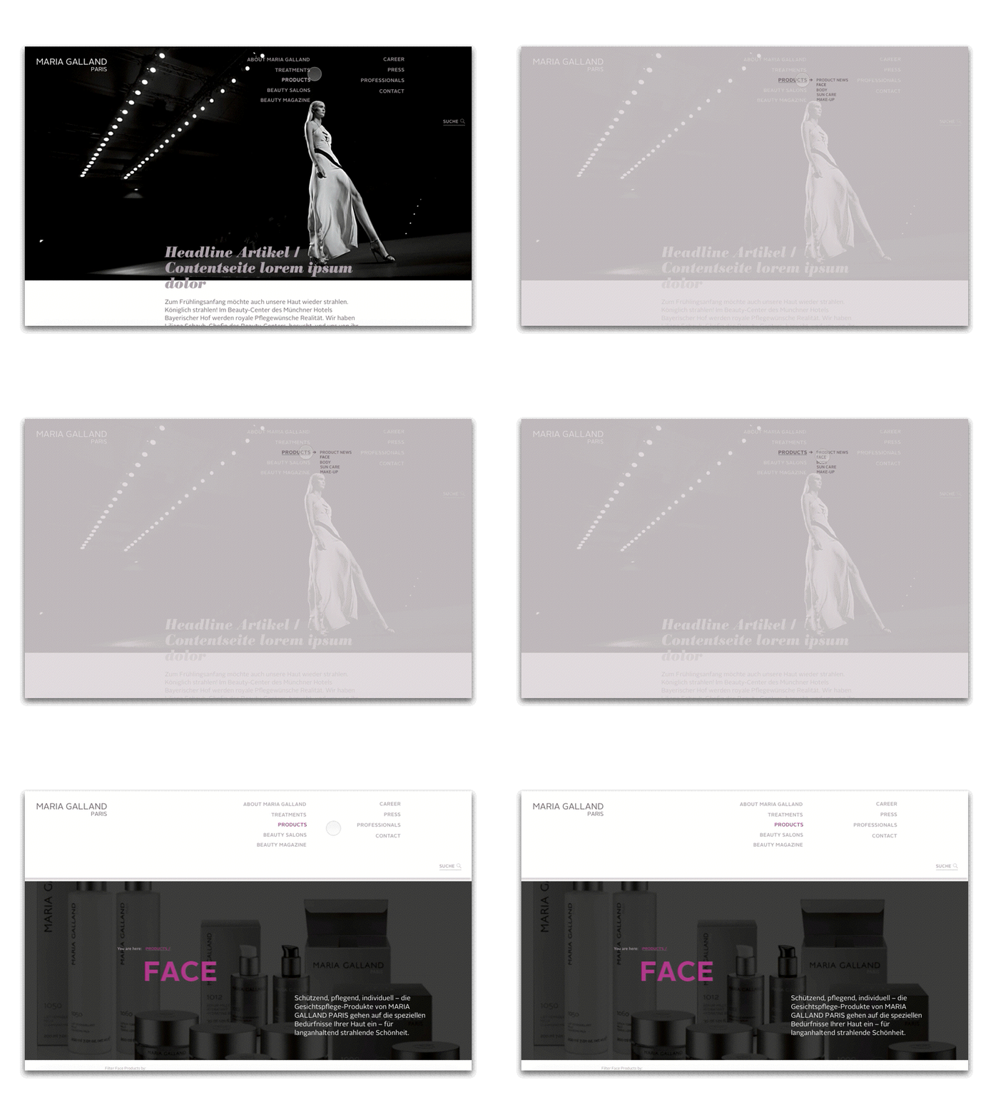
Example Prototype (Principle)
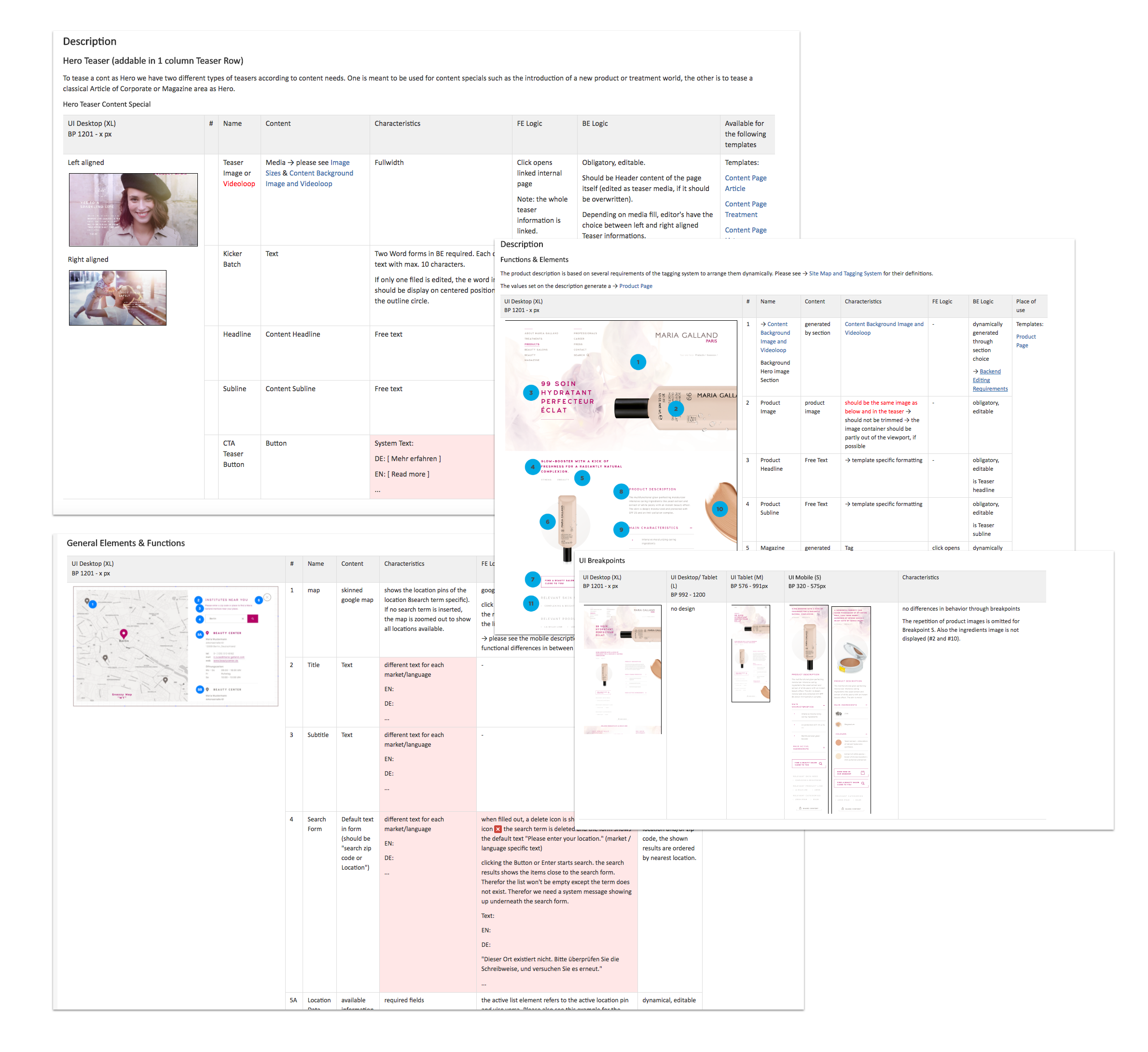
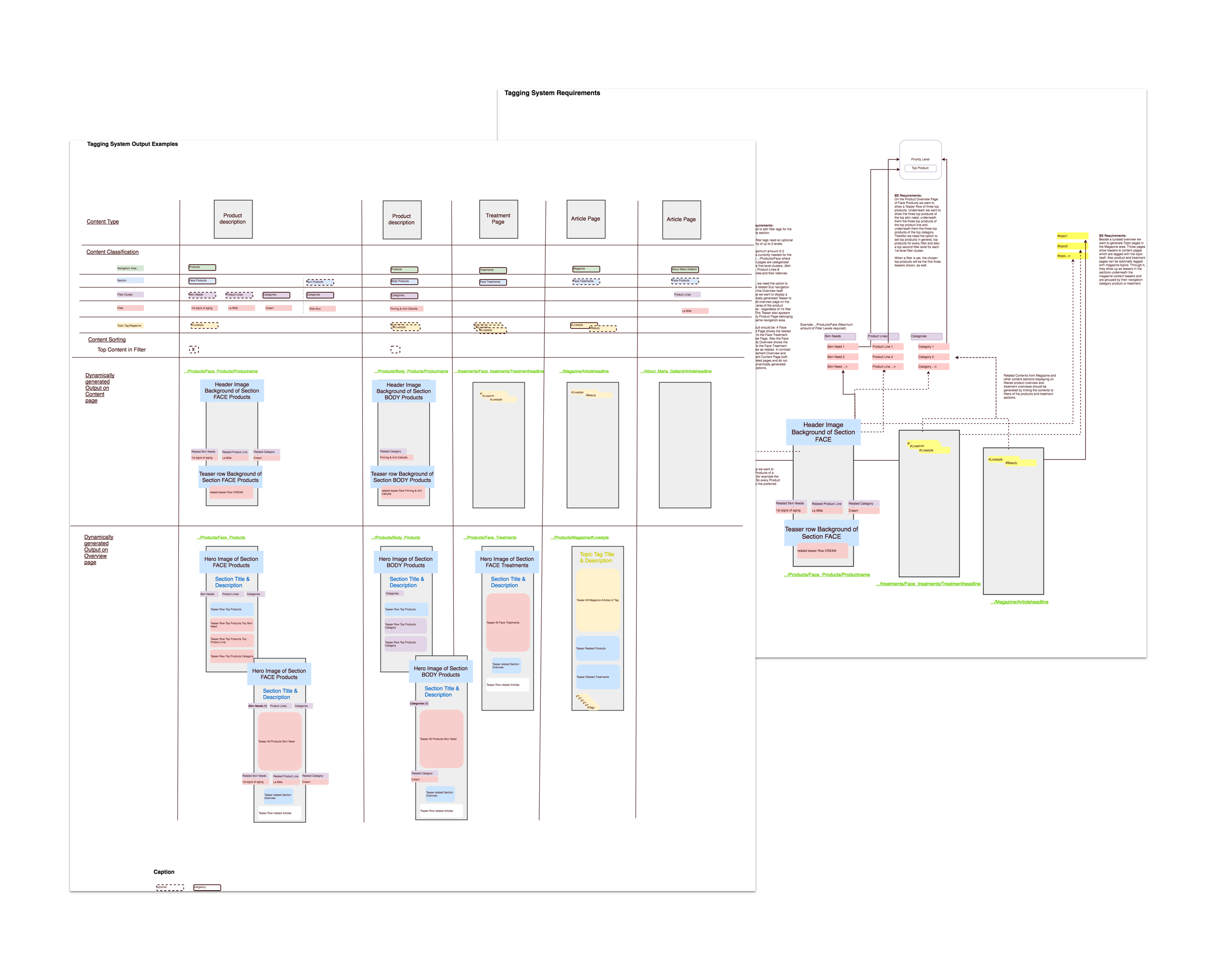
Examples Specification (Confluence)
Results
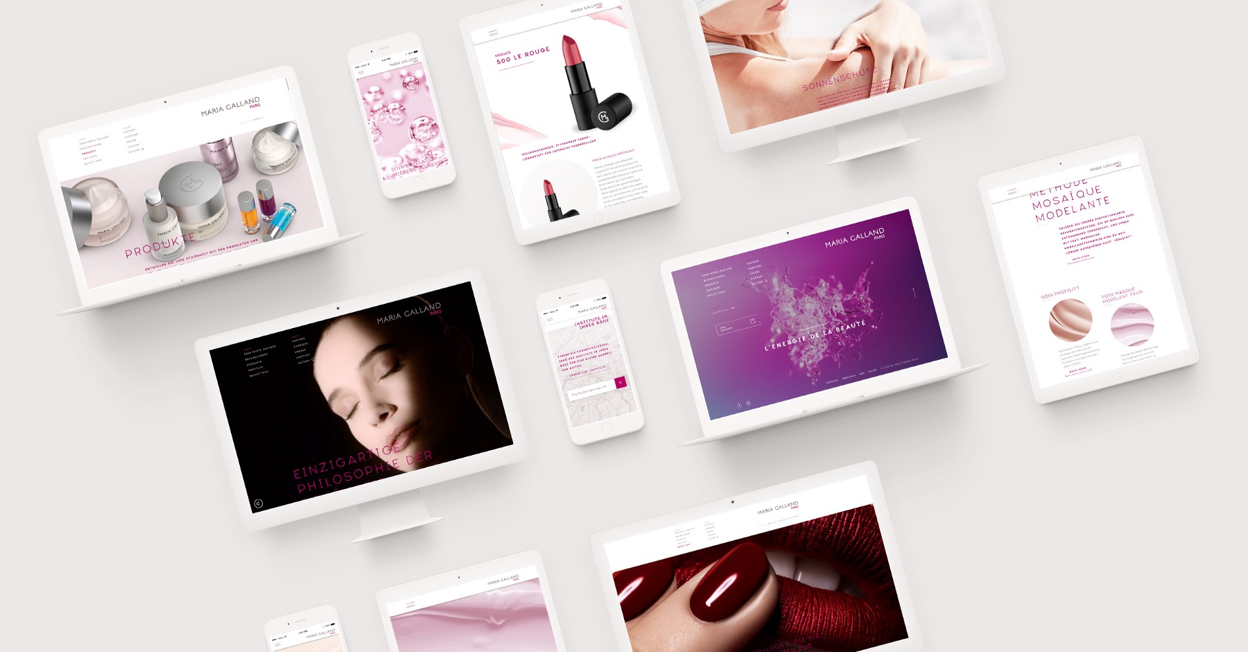
The new corporate website of Maria Galland Paris is a frontend masterpiece (in my opinion). It looks great, and works well with all the parallax and transition challenges we came up with.
The work on this project was great fun. Developing for Typo3 after some years not having the pleasure was a bit of a challenge, but it came out pretty easy in the end. We integrated as many dynamically generated stuff as never before, and I am glad to have seen it work, finally.
And look: they are happy and proud, as well.
Thank God – and thanks to Maria! 🙂

I loved working for a client to whom beauty and elegance is the perfect way to express and who has an open mind to what a good design has to offer.
And I also loved working with the C3 development department in Llublijana, they are really skilled and didn’t gave up to accomplish the conceptual goals I came up with.
Official statement by C3
“Für die renommierte Instituts- und Spa-Kosmetikmarke Maria Galland Paris hat C3 Creative Code and Content die B2C-Webseite runderneuert. Ergebnis des Relaunchs ist ein zeitgemäßer inhaltlich getriebener Markenauftritt, um neue und bestehende Zielgruppen mit der Expertise und den Behandlungsmethoden von Maria Galland Paris zu inspirieren.
Die Website ist dabei deutlich jünger geworden und stellt die drei Kompetenzfelder Behandlungen, Produkte und Lifestyle ins Zentrum. C3 leistete den konzeptionellen, inhaltlichen und technischen Aufbau der Seite, die im Dezember 2017 live ging.
Großes Reichweitenpotential mit einer personalisierte[n] Ansprache: Der Relaunch umfasst die Optimierung von Informationsarchitektur sowie User Experience und bietet Nutzern nun eine klare Navigationsstruktur. Die Inhalte decken in sechs Sprachen den größten Teil des europäischen Marktes ab und sind an die einzelnen Nutzerinteressen angepasst. Darüber hinaus bieten die intelligenten und personalisierten Serviceleistungen sowie ein zeitgenössisches, selbstbewusstes Design reichlich Erzählräume.
„Wir freuen uns, dass wir Maria Galland Paris mit unserem integrierten Ansatz überzeugen konnten: Inhaltlich relevante Markenerlebnisse brauchen eine Plattform, die diese Relevanz auch in User Experience und Design unterstützt. Mit dem Relaunch für Maria Galland haben wir genau dieses Ziel erreicht“, so Karsten Krämer, C3 Geschäftsführer und Standortleiter München.”
(published on Medium)
